Control charts are essential tools for improving manufacturing quality by providing insights into process stability and performance. This blog explores how control charts help identify trends, monitor variations, and ensure that products stay within quality limits. Thus, boosting overall efficiency and reducing defects. Learn how to effectively implement control charts to enhance your production process.
Real-time control chart software and continous process monitoring for quality improvement.
In manufacturing, once a process has been centerlined and is functioning efficiently, the next step is ensuring consistent quality control. Control charts play a pivotal role in this phase. As a fundamental tool in quality control, they enable manufacturers to measure and track key product characteristics systematically. By utilizing a process control chart in quality control, businesses can monitor stability and identify potential variations before they become costly quality issues.
The main purpose of control charts is to help determine if a process is stable and in-control. When a process is stable, or “in control,” this means the outcomes are predictable. The process is affected only by normal random causes of variation. An unstable or “out-of-control” process is affected by the same common causes of process variation. Additioanlly, it is affected by “special” or “assignable” causes. If you are successfully centerlining all important process variables, and your incoming raw materials are relatively consistent, then your process should be stable and in control.
Control Chart Basics in Quality Control
The control chart is an indispensable tool in quality control. It consists of plotted points on a graph that shows the time trend of quantifiable product characteristics. This is essential for monitoring and controlling the manufacturing process. Control charts in quality control include more than individual data points. They have three significant lines derived from historical data when the process was deemed ‘in control’.
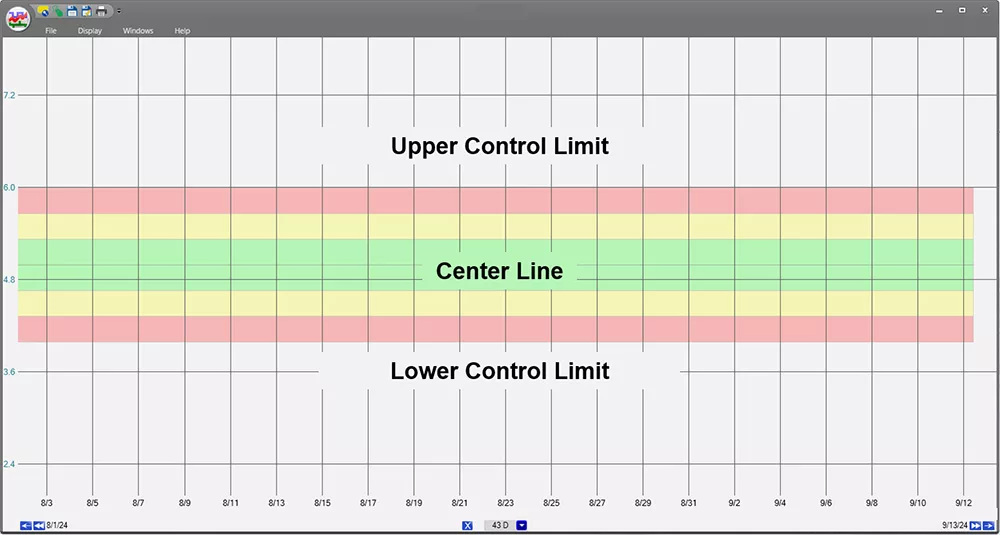
This trend displays the core components of a control chart in quality control: Upper Control Limit (UCL), Center Line, and Lower Control Limit (LCL). These elements help monitor process stability by identifying when data points deviate from expected performance levels.
Upper Control Limit (UCL) and Lower Control Limit (LCL): These lines are often set at three standard deviations (sigma) above and below the mean, respectively. The choice of three sigma limits ensures that, theoretically, 99.73% of all data points should fall within these boundaries if the process remains stable and in control.
Central Line (CL): This line represents the mean process average of the data. It provides a baseline or target value for the measured quality characteristic.
Theoretical Basis of Control Charts
The standard deviation, or sigma, is a measure of data dispersion or variability around the mean average. The foundational principle, established by Walter A. Shewhart, posits that a process is considered stable and ‘in control’ if over 99% of its values fall within the three-sigma control limits.
Any data point that falls outside these limits suggests an unusual occurrence or a special cause. This may require process adjustment or corrective action. Additionally, other patterns within plotted points, such as consistent upward or downward trends, or repeated cycles, also signal the need for further investigation.
Thus, a Shewhart chart, also known as a control chart, became the fundamental tool for achieving statistical control by monitoring process variability and performance over time.

Identifying Special Causes with Rules
To go further, several ‘rules’ have been developed to determine when a process is ‘out-of-control’ and influenced by special causes. These include what are sometimes referred to as the ‘Western Electric Rules’. Initially developed by Shewhart while at the Western Electric Company. These rules help in identifying patterns that signify process anomalies beyond normal variability, ensuring timely interventions to maintain quality standards.
By employing a control chart in quality control, manufacturers can achieve a deeper understanding of their processes. This allows them to maintain high quality and consistency in their products. The methodical approach supports immediate corrective actions. It also fosters a culture of continuous improvement and operational excellence in manufacturing environments
A Clear Example of Control Charts in Quality Control
To better understand how control charts work in quality, let’s go back to the coffee-making example from our post on Centerlining. Imagine that coffee strength was being evaluated on a scale of 1 to 10 each time a new pot was made. The results were then plotted on a control chart, like this:
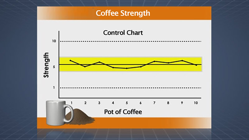
Control chart displaying coffee strength over time, with Strength on the Y-axis and Pot of Coffee on the X-axis. This visual helps track the consistency of coffee quality by monitoring variations in strength, ensuring production stays within acceptable limits.
Recall the center line represents the average number of recent coffee strength numbers. The dashed upper and lower lines represent the upper and lower control limits. If the coffee making process is stable and only affected by “common causes” of variation, virtually all coffee strength values should land inside the two control limits, scattered randomly above and below the centre line of the average value.
If the measured strength of the coffee strays beyond a limit, it suggests the presence of a ‘special cause’. This indications that the brewing process has deviated from its controlled state. Additionally, a noticeable upward or downward trend in coffee strength would similarly signal an issue. Prompting a need for process adjustments or corrective actions.
In such cases, the quality of the coffee could deviate from consumer expectations. Thus, resulting in a brew that is either too weak or too strong for most people’s liking. This simplified example illustrates how quality control charts are crucial in maintaining consistent product quality. They ensuring that every batch meets predefined standards.
Using Control Charts In Manufacturing Quality Control Processes
Used effectively, quality control charts are as much about minimizing the number of changes to the process as they are about making process changes. Let’s look at a couple of ways to use control charts that can help maintain process integrity:
Real-Time Process Monitoring with Control Charts
In real-time, effective quality control charts should communicate to the plant operator when the process has deviated outside of control. This enables to the operator to make changes to the process.
Use your facility’s Plant Information Management System (PIMS) or data visualization software to set up visual trends that include targets and limits. Configure alarms or alerts to be triggered when a tag value falls outside of the control limits. Alarms can also be set when the presence of a “special cause”. As indicated by one of the other Western Electric rules.
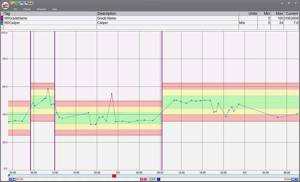
Real-time productin monitoring in trends filtered by product grade, with grade-specific control limits. This allows for a more focused view of individual processes, helping to monitor performance and ensure product quality remains within defined limits for each grade or product type.
Check out our real-time process analytics tools & see how better data can lead to better decisions.
Root Cause Analysis Using Control Charts in Quality Control
Quality control charts play a pivotal role in facilitating effective root-cause analysis, particularly within process information management systems (PIMS) and software like dataPARC’s PARCview.
These tools allow users to meticulously track and attribute data and document out-of-control events by assigning standardized reasons and adding detailed comments. Which is one of the steps in 5 why root cause analysis. The documented data is critical for subsequent analysis.
When combined with Pareto charts, the functionality of control charts extends significantly. Pareto charts, which highlight the most significant factors contributing to a problem, are invaluable for pinpointing the primary sources of production flaws.
By analyzing the variable data on the frequencies of these out-of-control events, Pareto charts help prioritize the issues that have the most impact on the process. This approach not only identifies the ‘low hanging fruit’—the most evident issues to address—but also aligns efforts towards the most effective solutions.
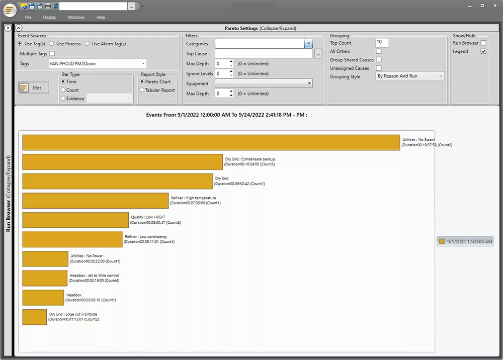
Pareto charts can complement control charts by helping identify the primary sources of production flaws, allowing for more targeted root cause analysis and process improvements. By focusing on the most frequent issues, teams can prioritize corrective actions that yield the greatest quality improvements.
In practice, using control charts to initially detect and document deviations provides a quantitative foundation for the qualitative insights offered by Pareto charts. This integration basic quality tools allows teams to:
- Systematically track and categorize production errors.
- Quantify the impact of different types of errors or deviations.
- Prioritize corrective actions based on the principle that a small number of causes often lead to a majority of the problems (the 80/20 rule).
Together, quality control analysis and Pareto charts used in quality control create a robust framework for continuous process improvement. This synergy not only enhances the understanding of process dynamics but also fosters a proactive approach to quality control, ensuring that efforts are focused on making the most impactful corrections to enhance overall product quality.

See how Catalyst Paper Improved Quality & Consistancy with PARCview
Take Action: Enhance Your Quality Control with Advanced Analytics
Quality control charts are an essential tool in the quality engineer’s toolkit, providing real-time monitoring of process variations and indicating when a process deviates from its controlled state.
By integrating quality control charts with Pareto charts, organizations can deepen their understanding of process issues, prioritize corrective actions based on their impact, and drive significant improvements in product quality. Together, these tools facilitate a strategic approach to continuous improvement, enabling businesses to maintain high standards of quality and efficiency
Are you ready to enhance your quality management practices and drive operational excellence? Discover how dataPARC’s PARCview can empower your team with the advanced capabilities of control charts and integrated Pareto analysis.
Start your journey towards optimized quality control by scheduling a demo or contacting our expert team today. Let us help you transform data into actionable insights and achieve new levels of success in your operations
OEE: The Complete Guide
All the resources you need to successfully implement, analyze, & improve overall equipment effectiveness.