The Pareto chart is a quality improvement tool that is based upon the Pareto principle, the principle that 80% of an outcome comes from 20% of its inputs.
Vilfredo Pareto, an Italian engineer and economist, first observed the 80/20 rule in relation to population and wealth. At the beginning of the 20th century, Pareto noted that in Italy and several other European countries, 80% of the wealth was controlled by just 20% of the population.
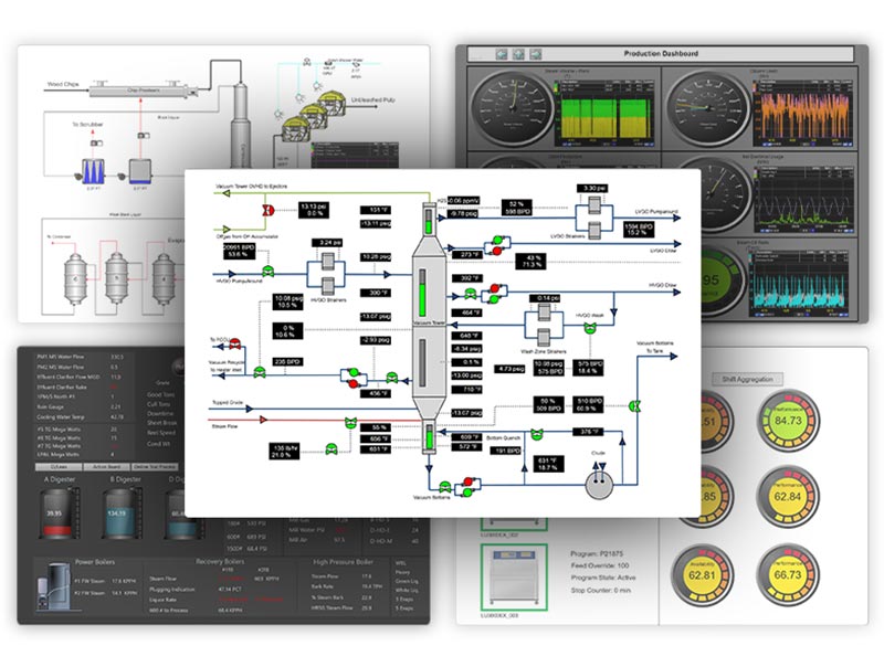
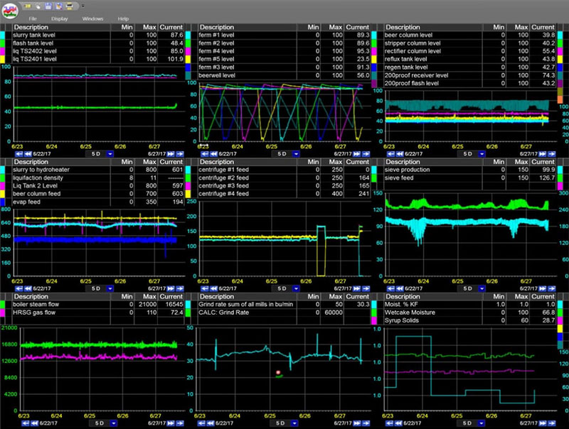
Monitor, report, & analyze data with pareto, XY plots and more to improve quality control.
The 80/20 Rule
It turns out that this 80/20 rule can be applied to many different systems:
- In transportation, 80% of the delays might result from 20% of the possible causes
- In business, 80% of the revenue might come from 20% of the customers or 20% of the products
- In a manufacturing process, 80% of the downtime might result from 20% of the problems
A Pareto chart is one of the key tools used in total quality management and six sigma methodologies. It is basically a bar chart showing how much each cause contributes to an outcome or effect. The length of each bar represents the “cost” (in time, number, or money) of each cause, and the bars are arranged longest to shortest to visually emphasize the most significant or principal causes.

Using Pareto Charts For Quality Control
Pareto charts can be used in several different ways, including:
- To analyze the frequency of problems or defects in a process
- To analyze broad causes by examining their individual components
- To help focus efforts on the most significant problems or causes when there are many
- To help communicate the significance of problems or causes to others
Use Pareto charts to identify problems with a process…
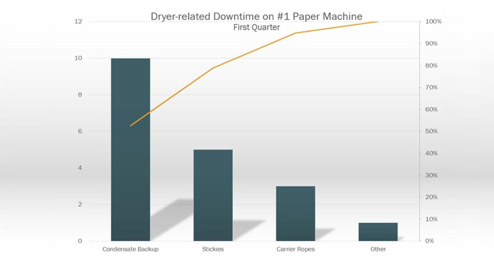
…and drill down into those problems to analyze their individual components.
On the road to digital transformation? Get our Free Digital Transformation Roadmap, a step-by-step guide to achieving data-driven excellence in manufacturing.
Steps To Create A Pareto Chart
To create a Pareto chart, perform the following steps:
Establish A Purpose
The first step in creating a Pareto chart is to establish its purpose. What outcome or effect are you interested in? This could be downtime for a manufacturing process, customer complaints for a service provider, or delayed shipments for a shipping company.
Determine Causes and Measurement
Next, you must decide how to group the causes and what measurement is appropriate. Common measurements are time, number, frequency, and cost.
Determine Timeframe
Determine the time frame for the chart. Do you want to look at the data by shift, day, week, or month?
Collect Data
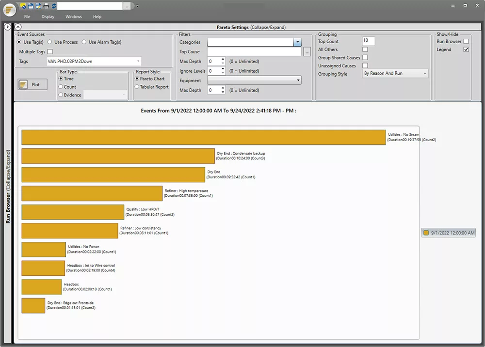
Determine how the data will be collected. This can be done by hand, using a spreadsheet, or perhaps most conveniently, using a data historian. The easier this is, and the better defined the causes, the better. Some PIMS and data historians allow Pareto variables to be entered to help with downtime and production loss analysis.
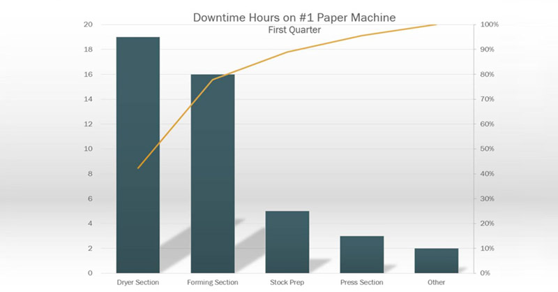
Pareto charts visualize defects in descending order, allowing for focused efforts on the areas that will have the greatest impact on improvement.
Analyze Data
Calculate the subtotal for each cause for the chosen time frame. If desired, you can calculate the percentage that each cause contributes. For each cause, this would be equal to its subtotal divided by the total for all of the causes. A percentage scale can then be drawn opposite the measured value scale.
Check out our real-time process analytics tools & see how better data visualization leads to better decisions.
Build Chart
Construct the chart, with causes listed on the x-axis and measurement units on the y-axis. Place the cause with the longest bar at one end and then arrange the remaining bars in descending order. (If you have several very small bars, you can group them into one small bar labeled “Other.”)
Cumulative percentage curves are often plotted on Pareto charts. To draw this curve, at the first bar, draw a dot at the percentage the first cause contributes. At the 2nd bar, add the first percentage to the 2nd percentage, and place the 2nd dot at the sum. Add the 3rd percentage to the previous sum to place the 3rd dot, and so on. The last dot should be at 100% on the percentage scale. Finally, connect the dots to create a cumulative percentage curve.
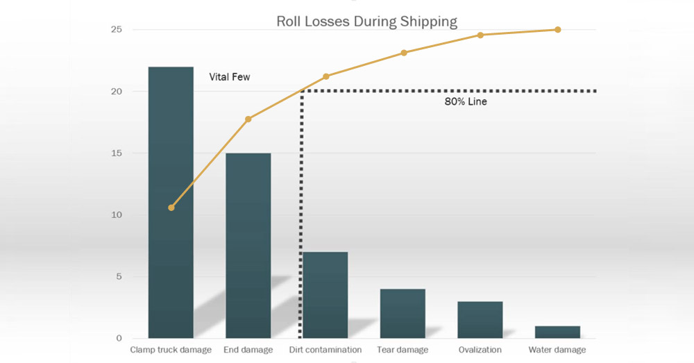
Using Pareto charts to identify the “vital few” and direct improvement efforts
At this point, if you’re interested in applying the 80/20 rule, draw a line starting at 80% on the percentage scale, running parallel to the x-axis and stopping where it contacts the cumulative percentage curve. The causes that fall to the left of this point are the causes (the “vital few”) that contribute to 80% of the problems, while the causes to the right are less important. This can help you focus improvement efforts on the causes that can have the most impact on the problems.
OEE: The Complete Guide
All the resources you need to successfully implement, analyze, & improve overall equipment effectiveness.