There are many different systems available for storing and analyzing manufacturing process data. A historian is a database application that provides a means of storing the data. Nowadays, historians are a commodity and sites routinely have multiple sources of data – everything from embedded historians in control systems to custom databases for specific purposes. The true value is in how the data is used, not where it is stored. So what makes good visualization software for data historians?
Check out the best process data trending & visualization tools available.
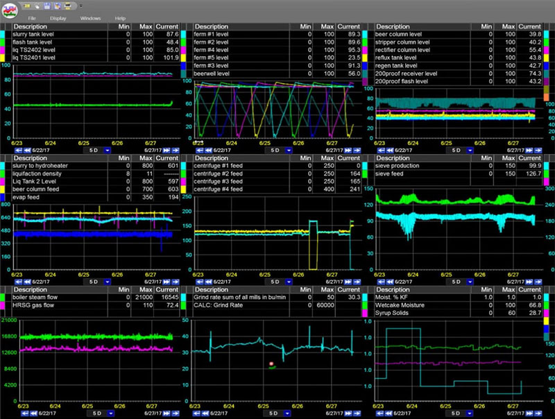
We have all heard the adage “a picture is worth a thousand words,” so it should be obvious that visual representations of data make analysis easier and faster. The simple example below illustrates the advantage of visual data over numerical data.
Find the day with the highest temperature in the past month:
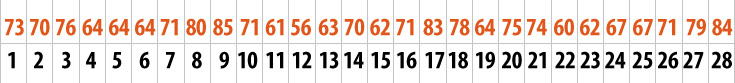
Raw numbers are difficult to scan for actionable data.
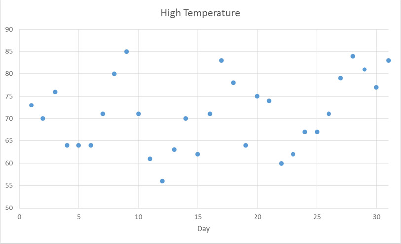
Data presented visually, in a meaningful layout, is much easier to interpret.
What Makes Good Visualization Software for Data Historians?
The list of visualization software products continues to grow every year. Most visualization products provide a standard package for a specific need, such as SPC/SQC, downtime tracking, or OEE. Some visualization tools are configurable dashboards that are mostly static, and some tools are used more for real-time analysis. The main issue is that most visualization products fall into one of two categories:
- Jack of all trades, master of none
- Specialized and rigid
Ideally, you want a system that is a jack of all trades, master of many. It should provide many standard capabilities with the flexibility to provide specialized applications. In order to find the right balance of flexibility and usefulness, visualization software for data historians should provide:
Usability
Ease of use is one of the most important factors for successful data visualization products. Resources need to spend their time making decisions, not gathering data, so the system must make it easy to access, manipulate, and analyze the data. The goal is to reduce the mean time to insight.
Adaptability
Data from multiple data sources (process, quality, maintenance, planning, accounting, etc.) needs to be integrated. Data from every source should be available to everyone, without double storage or tedious configuration. For example, it is critical to compare online process measurements to manual test data. Similarly, visualization software for historian data should provide multiple solutions in one package because you want to have access to all visualization tools and analysis methods in a single package. Not all data can be automatically captured, so users should be able to configure calculations and manually enter data.
Proactivity
Another important feature, is the ability to perform ad hoc analysis, which is produced one time to answer a single, specific question. The tools need to facilitate proactive instead of reactive problem solving.
Interactivity
Visuals should be interactive to provide the ability for deeper analysis. For example, being able to drill down into graphs or interactivity between graphic types. The ability to start with one visual and create new visuals is powerful. In PARCview you can start with data on a trend and easily plot on an x-y chart or create a histogram.
Dynamic Data
Display data should update as the data changes in the database. This also involves using an asset structure, so visuals only need to be built once and the content can be filled in based on user selections. This allows fast and easy comparisons between similar processes.
Personalization
This is an important feature because every user has different needs and capabilities. Different users want to look at information in different ways to solve different problems.
Notifications
Even with the best visuals, you can’t see everything all the time. As a safeguard, a good system needs to monitor variable limits and send out alerts to the appropriate audience so action can be taken.
Standard Features
There must be standard, out-of-the-box features that are simple to execute without complex, custom programming. The functions that will be used by most people, most of the time, must be easy and effective. Some common out-of-the-box analysis tools you should look for include:
- Trending
- Charts (scatter plot, histograms, Pareto charts, etc.)
- Dashboards
- SPC/SQC
- Lost opportunity analysis, such as downtime
- OEE
- Multivariate statistical analysis and modeling
Universal Access
All data needs to be visible to all levels in the organization. Wide visibility ensures decisions are based what actually happened and not on what we think happened. Also, this can empower operators and create a bottom-up, instead of top-down, flow of information. Mobile device access is another key feature for state-of-the-art data analysis tools.
Context
It is important to be able to compare data against limits and standards. Also, providing event windows, such as grade runs, batches, reels, or weeks, is an essential capability. For example, a trend of chemical consumption should include the product/grade that was being manufactured during the time frame and any limits that might help indicate abnormal consumption.
The Best Visualization Software for Data Historians
The PARCview suite of products provides a standard set of specialized tools and the flexibility to do everything else effectively. In other words, a jack of all trades, master of many. To do this, PARCview capability is based on the 80/20 Rule (Pareto’s Principle). Basically, PARCview tries to make it as easy as possible to do 80% of what you need for data analysis and then provide the framework to do the other 20%. For example there are built-in tools to track downtime events and assign reasons. So, if you look at it from a functional perspective, PARCview can really be used to track any type of event (e.g., an environmental excursion or running below target speed) and assign causes to those events. There is an event generation tool (PARCalarm) with 13 event generation rule templates built in, including Western Electric Rules for statistical process control and alarms for values outside limits. For situations that aren’t covered by the 13 templates, there is a custom script tool to configure an alarm based on an equation.
The real value is that the visualization and analysis tools are configured for generic, not specific functionality. No matter what type of event you configure, the data can be accessed by all PARCview applications. For example, there is a Pareto Chart tool for downtime, but it can also be used to assess any event type. Also, a configurable reason tree can be used to assign causes and comments to all events.
The following tools are built in to PARCview to support data analysis:
Trends
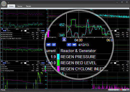
A trend, or run chart, is a basic visual tool that graphs variable data vs time. Run charts are an excellent starting point for troubleshooting because you can get a quick visual analysis of a problem. With data tables that display the current value or an aggregated value you only get one data point. When you use a trend, you can tell where you are but also where you have been and you can predict where you are going. This is incredibly important for solving operational problems and making fast informed decisions. That is why the Trend is the foundation of the PARCview system.
Charts
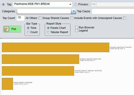
Besides trends, there are many other graph types to help analyze data. Pareto charts are used to help prioritize potential causes and focus improvement to achieve the biggest impact. Histograms help analyze the distribution of values for a given variable. When limits are included, histograms show process capability. Scatter, or x-y plots, are valuable for identifying a relationship between two variables. Control charts are used to see how a process value changes over time. All of these charts are available in PARCview.
Dashboards
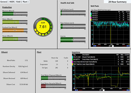
Dashboards are another important feature of visualization packages. Dashboards are used to provide a snapshot to help stakeholders focus on the important information related to a key performance indicator, such as OEE, production, cost, quality, or safety. Good dashboards are dynamic and interactive, so you can drill down and explore the data. PARCgraphics provides a dynamic dashboarding tool with live gauges and the ability to embed any PARCview chart.
Process Graphics
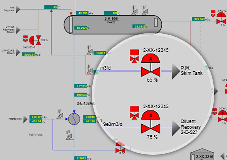
A graphical representation of a process can contain a lot of information in a single snapshot. Visually displaying process connections and values can especially helpful. PARCview process graphics can display current values with blinking alarms and animations, and there is a playback mode for performing a historical analysis.
The following tools support the standard features above, but also allow for user-defined analysis:
Calculations
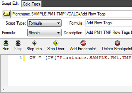
A script editor allows simple mathematical expressions or complex multivariable calculations with tags from any data source. New tags can be created based on the calculation and they become immediately available. Also, aggregate values (average, standard deviation, min, and max) can be calculated automatically for any time period. The time period can be time based (hour, shift, production day, etc.) or process based (grade, batch, etc.).
Limits
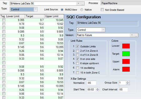
PARCview can keep track of many limit types, including control, specification, operating, safety, and custom. Limit values can be fixed or variable based on grade, rate, or tag value. All limit history is maintained and they can be accessed from all PARCview displays. Another useful feature that eliminates the need for an external program, is an automatic control limit calculator.
Alarms
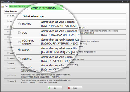
As previously mentioned, PARCalarm can be set up to trigger and track any event, such as downtime or an environmental excursion. For each event, reasons can be assigned. All of the event data can be integrated into PARCview for analysis and reason assignment. Not everything can be watched at all times, so alarms can be configured to send notifications to specified people if action is required.
Digital Transformation Roadmap
Download our Digital Transformation Roadmap and learn what steps you can take to achieve data-driven success in manufacturing.