Predictive models are extremely useful in monitoring and optimizing manufacturing processes. Predictive modeling in manufacturing, when combined with an alarm system, can be used to alert changes in processes or equipment performance and prevent downtime or quality issues before they occur.
A process engineer or operator might keep an eye on real-time dashboards or trends throughout the day to monitor the health of processes. Predictive modeling, when combined with a proper alarm system, is an incredibly effective method for proactively notifying teams of impending system issues that could lead to waste or unplanned downtime.
In this article, we’re going to review two examples of predictive modeling in manufacturing. First we’ll describe and build an example of a PLS model, and then we’ll describe and build and example of a PCA model. PLS vs. PCA. Why choose one or the other? We’ll cover that as well.
Contents
Identify process issues before they occur. Prevent unplanned downtime, reduce waste, & improve efficiency.
What is PLS in Manufacturing
PLS stands for “Partial Least Squares“. It’s a linear model commonly used in predictive analytics.
PLS models are developed by modeling or simulating one unknown system parameter (y) from another set of known system parameters (x’s).
In manufacturing, for example, if you have an instrument that is sometimes unreliable, but you have a span of time in which it was very reliable, it is possible to simulate, or model, that parameter from other system parameters. So, when it moves into an unreliable state, you have a model that will approximate, or simulate, what that instrument should be reading, were it functioning normally.
PLS Model Formula
We promise we’re not going to get too deep into the math here, but this is a PLS model formula:
y = m1x1 + m2x2 + … + mnxn + b
In this formula, the single (y) is approximated from the (x’s) by multiplying each by a coefficient and adding an intercept at the end.
PLS Analysis Use Cases
Some potential uses for PLS models include:
Simulating flow from valve position, power, or delta pressure (dP)
An example provided by one of our customers involved modeling flow from pump amps.
In this particular case, they had a condensate tank in which the flow kept reading zero on their real-time production trend, even though they knew their pump was pumping condensate.
Using dataPARC’s predictive modeling tools, they looked at the historical data and found periods of time when there was a flow reading, and they modeled the flow based on the pump amps during those same periods.
So, when the flow itself got so low that the flow meter wouldn’t register it, they still had a model of flow based on pump amps, because the pump was still pumping and registering pump amps.
Producing discrete test results modeled from a set of continuous process measurements
For example, there may be something you only test every four to six hours. But, you’d like to know, between those tests, if you’re still approximately on-line, or still approximately the same.
If you have continuous measurements that can be used to approximate that value that you’re going to test in four to six hours, you can build a model of those discrete test results based on what those readings were when the previous test was conducted.
Those are just a couple of examples of how you can use PLS for predictive modeling in manufacturing.
How can predictive analytics work for you? Prevent unplanned downtime, reduce waste, & optimize processes with dataPARC’s predictive modeling software.
How to build a PLS Model
So, now let’s look at building a PLS model. We’ll use the example we discussed where we simulate flow using delta pressure data. First we need to identify the tags or variables we’ll be working with.
Identify Variables
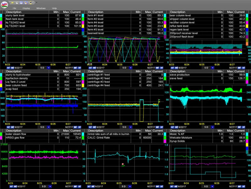
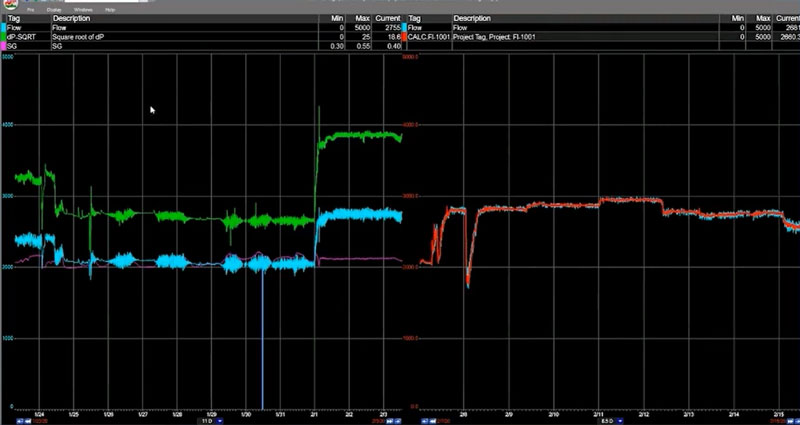
Using dataPARC, we build these models from trends. Here we have a trend showing Flow (blue), Square Root of dP (green), and Specific Gravity (pink). This data is being pulled from our data historian software.
A basic trend with the three variables we’ll be using for our PLS model
Flow
Flow is the variable we want to model, or predict. It’s the “y” in the formula we described above.
Square Root of dP
Flow is related linearly to the square root of dP. Not to dP itself. So, since the PLS model is a linear model, we’ll create a calculated tag in dataPARC by subtracting the downstream pressure from the upstream pressure and taking the square root of that difference. This will be our Square Root of dP variable that we can use in this linear model.
Specific Gravity (SG)
We’ll use Specific Gravity as our second x. In this example we’re not sure if Specific Gravity is necessary for this model, but it’s really easy to add tags to this equation, determine their importance, and remove them if they’re not needed. We’ll include it for now.
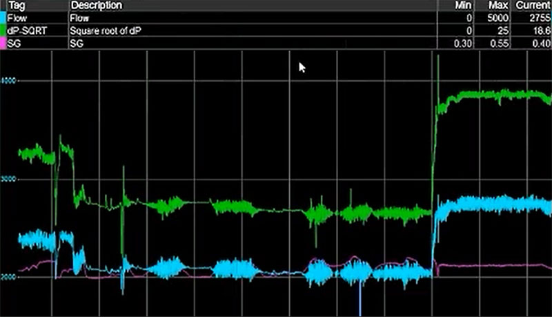
Establish Time Periods for Evaluation
So, on the left we’ll select data from Jan 24 – Feb 3. This is the data we’ll use to build our model. On the right we’ll select data from Feb 8 – Feb 17. This is the data we’ll use to run our model against to evaluate its viability.
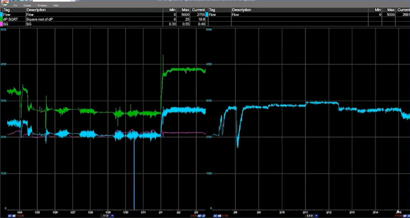
On the right side of this split graph, we have the same flow tag, but for a different period of time. This is how we’ll evaluate the accuracy of the model we’ve built.
It is very important to evaluate a model against a time period that is not included in the dataset. To determine if the model is valid going forward. Because as time goes on, it will be using data that it never saw.
Generate the Modeled Data
With dataPARC’s predictive modeling tools, building the model is as simple as adjusting some configuration settings and clicking “Create New PLS Model”. The model will be generated using the data from the tags in our trend we looked at previously. Of course, with more effort, this data can also be produced and managed in Excel as well.
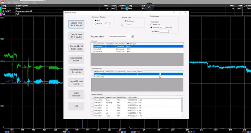
Creating a PLS model with dataPARC
Evaluate the PLS Model
The first thing you want to do when you build a PLS model is clean up the data. Or at least look for opportunities to clean up the data.
T1 vs. T2
First let’s look at the T1 vs. T2 graph. Again, we don’t want to get too deep into the math, but what we’re looking for here is a single grouping of data points within the circles on the graph. A single “clump” of data points indicates we’re looking at a single parameter, or operating regime. If it appeared we had two or more clusters of data points, it’d be a good indication we have multiple operating regimes represented in our model. In that case we’d want to go back and build distinct models to represent each regime.
everything looks good here, though, so let’s proceed.
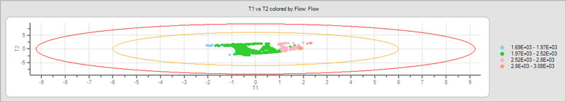
Looking pretty good so far.
If a lot of your data is outside these circles it’s an indication that your model isn’t going to be very good. Maybe there are some additional tags that you need include in the model, or maybe the time period you selected is not good.
Y to Y
Using a common Y to Y plot, we can view the original y and the predicted y plotted against each other. In this example they’re very close together and you can see that the R-squared value is ridiculously high, which we’d expect when we’re modeling Flow from the Square Root of dP.
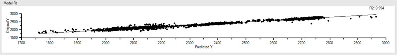
Check out that R-squared. 0.994.
So, you’d think with that kind of R-squared value we’d be ready to call it a day, but using dataPARC’s predictive modeling software, we like to take a look at one more thing.
Variable Importance
As expected, our Square Root of dP variable is extremely important, with a value of .942 – roughly 94% important to our model.
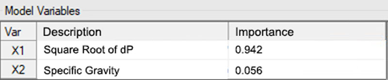
Looks like we did good with our Square Root of dP calculation.
If you recall, we added another tag, or variable, into the mix at the beginning – Specific Gravity (SG). Now, this was primarily to illustrate this Variable Importance feature.
As you can see less than 6% of the model is dependent on Specific Gravity. We expected this. Specific Gravity isn’t really useful in this model, and this Variable Importance feature backs that up. To simplify our model and perhaps enable it to run faster, we’d want to eliminate Specific Gravity and any other variables that aren’t highly important.
Save Your PLS Model
Now that our model is complete, we’ll want to save it so we can apply it later. In dataPARC’s PARCmodel predictive modeling software, you get this little dialog here where you can put in a project name and model name.
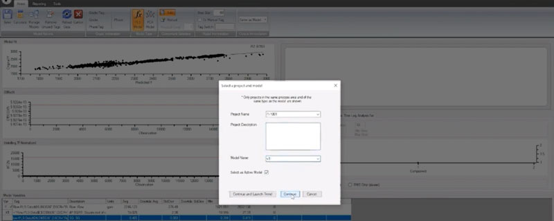
Saving our model in PARCmodel
How to Apply a PLS Model
So, now that we’ve built our model and saved it. We’re going to want to apply it and see if it works.
Remember earlier, when we chose two time periods for evaluation? Well, now, going back to our trending application, we can import the model we built from our source data and lay that over real data from that second time period to see how accurately it would have predicted the flow for that period of time.
Our predicted data, on the right, in red, falls right in line with real historical production data.
Well, well, well. It appears we have a valid test.
We used an 11-day period in late January (the trend on the left) to create a model, and now, the predicted values of the Flow (the red line on the trend on the right) over an 11-day period in mid February are nearly identical to the actual values from that time period. Perfect!
What is PCA in Manufacturing
PCA is one of the more common forms of predictive modeling in manufacturing. PCA stands for Principal Component Analysis. A PCA model is a way to characterize a system or piece of equipment.
A PCA model differs from a PLS model in that, with a PCA model, there is no “y” variable that you’re trying to predict. A PCA model doesn’t attempt to simulate a single variable by looking at the values of a number of other values (x’s).
Instead, each “x” is modeled from all other x’s. A PCA model is a way of showing the relationship between all the x’s, creating a “fingerprint” of what the system looks like when it’s running.
With a PCA model, you’re trying to say “I have a system or a piece of equipment, and I want to know if it has shifted, or moved into a different operating regime.” You want to know if it is operating differently today than it was during a different period of time.
PCA Analysis Use Cases
Some potential uses for PCA models include:
Diagnosing instrument or equipment drift
For example, you may have an instrument in the field that you know scales up over time, or something that is subject to drift, like a pH meter that you have to calibrate all of the time. When reviewing the values from that instrument, it can sometimes be difficult to know if changes in values are due to drift or if they’re a symptom of more significant equipment or process issues.
If you have a period of time during which you know all of your instruments were good and your process was running optimally, you can use that as your “thumbprint”. This is what you build your PCA model from, and then your PCA statistics that you trend into the future can tell you if something is shifting.
Flagging significant process alterations
A common example here is when a manual valve that is always open or should always be open, somehow gets closed. Since there’s no indication in a DCS or PLC that a manual valve has been closed, all the operator sees is that something is different. They don’t know what it is, but they recognize that something is different.
A PCA model can help here by automatically triggering an alarm or flagging significant changes in a process. The model can’t specifically see that the valve has been closed, but what it does see, for example, is that a pressure reading related to the flow is now different. Or, the control valve used to have x impact on flow or x impact on temperature, and it’s no longer affecting those variables.
PCA can tell you that something in the relationship between components or parts of a process is off, and it can help you get to the root cause of the issue.
How to Build a PCA Model
So, let’s take a look at building a PCA model for a pump. It’s a small system, and we’re going to set up a model to see when it deviates from its normal operating regime.
These steps will be nearly identical to those we covered in how to build a PLS model above. The one major difference is that we don’t have a y value that we’re trying to predict, so we’ll just need to select as many x variabls as we need to represent this particular system.
Identify Variables
We’re going to be using the following tags (x’s) to build our pump model:
- Amps
- Flow
- Speed
- Specific Gravity (SG)
- Vibration (Vib)
- Total Dynamic Head (TDH)
- Temp
Establish Time Periods for Evaluation
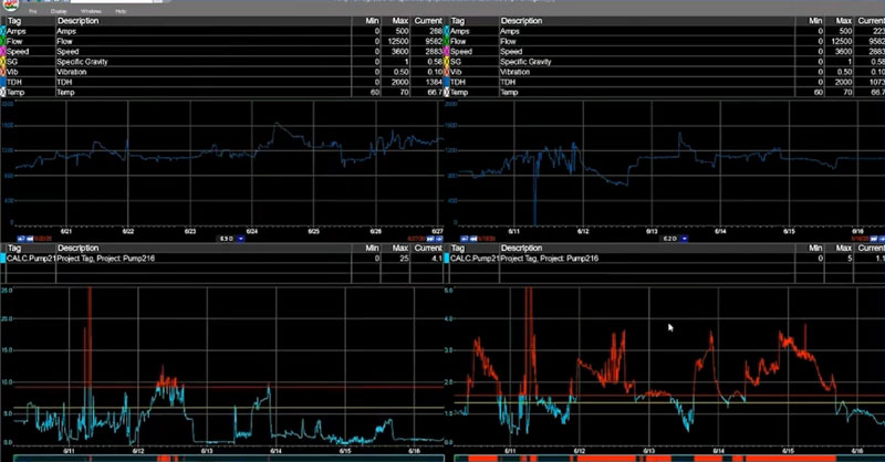
Again, as we did with our PLS model, we’ll have our split trend that shows the data on the left that we’ll use to build our model, and the data on the right that we’ll use to evaluate the accuracy of the model.
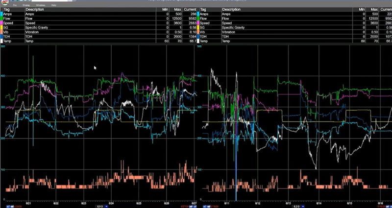
Source data from our model on the left, and the data we’ll check it against on the right.
Generate the Modeled Data
A couple clicks here and bam. We have our PCA model.
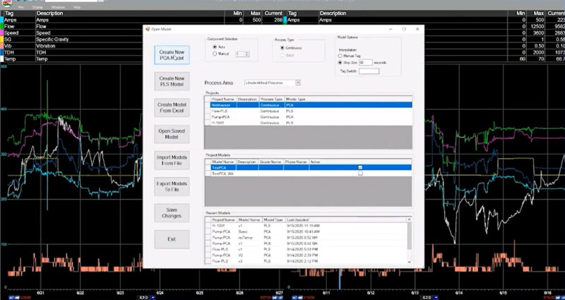
PARCmodel makes predictive modeling in manufacturing easy.
Evaluate the PCA Model
So, how’s our model shaping up?
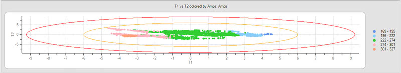
T1 vs. T2
Looking at T1 vs. T2 we appear to be off to a good start. All of our data seems to be grouped pretty tightly together, so that’s a good indication we’re looking at a single operating regime here.
DModX
Now let’s look at our DModX trend. This is particular to our PCA model.
DModX represents the distance from an observation to the Model in “x” space. “X” meaning how many dimensions we have. So, in this case we have seven x’s, or seven “dimensions.” There are thousands of “observations” that make up this DModX trend.
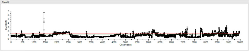
In our DModX trend, we can see that there are a few observations that are higher than the red line, which we can think of as the point of statistical significance. When we start getting a lot of observations above this line, it’s an indication that our model isn’t very good.
In this case, we have a few points bouncing around the red line, and on occasion going above it, but this is acceptable. This is what an accurate model generally looks like in DModX.
Hotelling’s T-Squared Normalized (HT2N)
Unlike DModX, HT2N isn’t showing us how the model is performing, or how the observations fit within the model. Instead it’s showing us how the observations fit within the range of all the other x’s. HT2N is also particular to our PCA model.
For example, it looks like there was a period of time here were there was something in the system – maybe multiple x’s – that were significantly different in range from all of the other periods of time before and after.
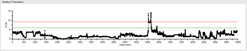
However, if we see a high HT2N it isn’t necessarily an indication that our model is bad. For instance, even though there were some parameters that had an unusual range, this spike in HT2N clearly falls within acceptable parameters of the corresponding DModX trend. As we see below, they fit within the model just fine.
So, sometimes it’s ok to leave a high HT2N set of data in there because you’re leaving the range of your data expanded. And at times there’s a reason you’ll want to do that.
Let’s say one of your x’s is a production rate. The “model set” models production between 500 and 800. And one day, your production rate went above 750. That might result in a spike like we see in the trend above.
How to Apply a PCA Model
Ok. So, we’ve created our pump model and, in our case, saved it using dataPARC’s predictive modeling software. Now we’re going to go back out to our split trend and apply the model to the timeframes we identified earlier.
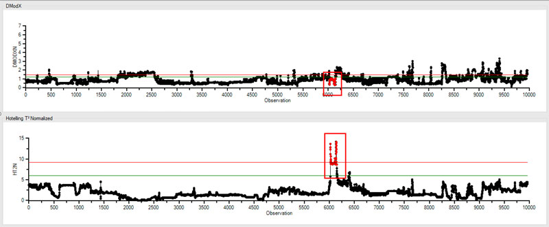
We’ll use a 4-up view in our PARCview trending application, and isolate the DModX and HT2N tags in the bottom two trends.
PARCmodel automatically adds “limits” to a PCA model when it’s created, so if we turn visibility for limits on in our trending application, we can easily see where our data is going outside of our model.
With the limit data now identified, we can dig in using our favorite analytics toolkit and perform root cause analysis to determine if there’s an issue with this pump assembly.
Predictive Modeling in Manufacturing
So, there you have it. If you’re looking for good examples of applied predictive modeling in manufacturing, PLS and PCA are two common models useful in monitoring and optimizing manufacturing processes.
An engineer or operator might keep an eye on real-time dashboards or trends throughout the day but it can be difficult to spot potential process issues in time to avoid production loss. Predictive modeling software, when combined with an alarm system provides process manufacturers with an incredibly effective and reliable method for identifying issues before they occur – preventing unplanned downtime, reducing waste, and optimizing their manufacturing processes.
Want to Learn More?
Download our Digital Transformation Roadmap and learn what steps you can take to achieve data-driven success in manufacturing.