How Does Information Answer Questions?
Does the information you find always answer the right questions – the questions that you want answered?
If you’re anything like many, you’ve been following the data for COVID-19 closely, perhaps playing amateur epidemiologist.
It’s the storyline of this year, the decade and maybe our lifetime. But these efforts also reinforce the relationship between information and the questions being answered.
All information answers a question, the right information easily answers your question.
A combination of the right data and the right way of displaying that data is what works. These are the same pillars that industrial data analysis has been built on for years. Let’s look at a few of the main resources and see what questions they’re answering.
Let’s first discuss which KPI’s to use. Ideally, we could find out in real-time how many people are infected each day. We already have data showing the total number of positive tests each day, but this data is only valuable if there are enough tests and testing is consistent across the country.
Unfortunately, this is not the case, so this KPI is far from perfect. But this data is the most widely available and it can be directionally helpful as testing ramps up. The next best leading indicator would be hospitalizations. We’ve found this data on a local level, but not nationally. This leaves us with the most visible and tragic of data, the deaths caused by COVID-19.
It will be a great day when this number is zero.
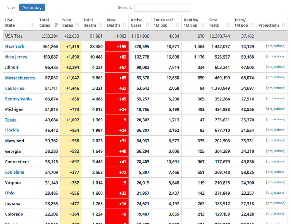
One of the most widely cited sources is Johns Hopkins
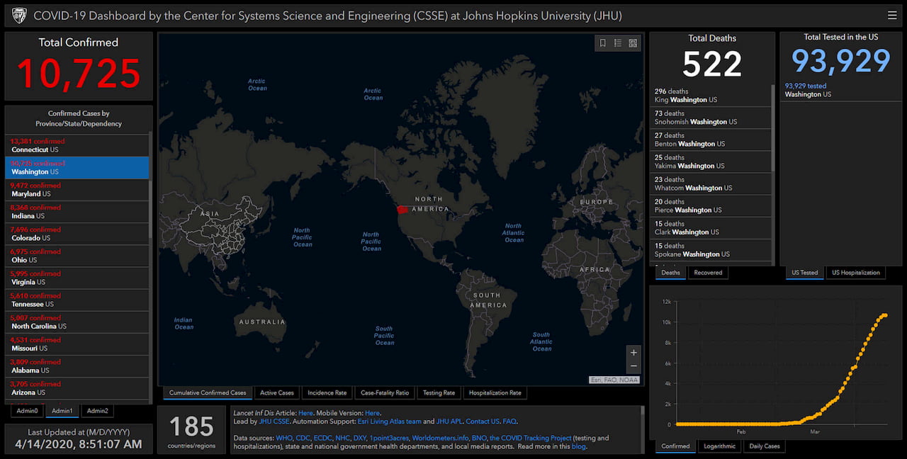
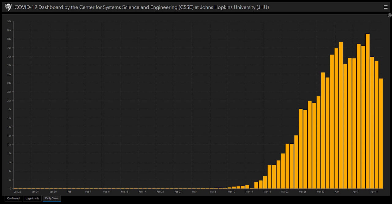
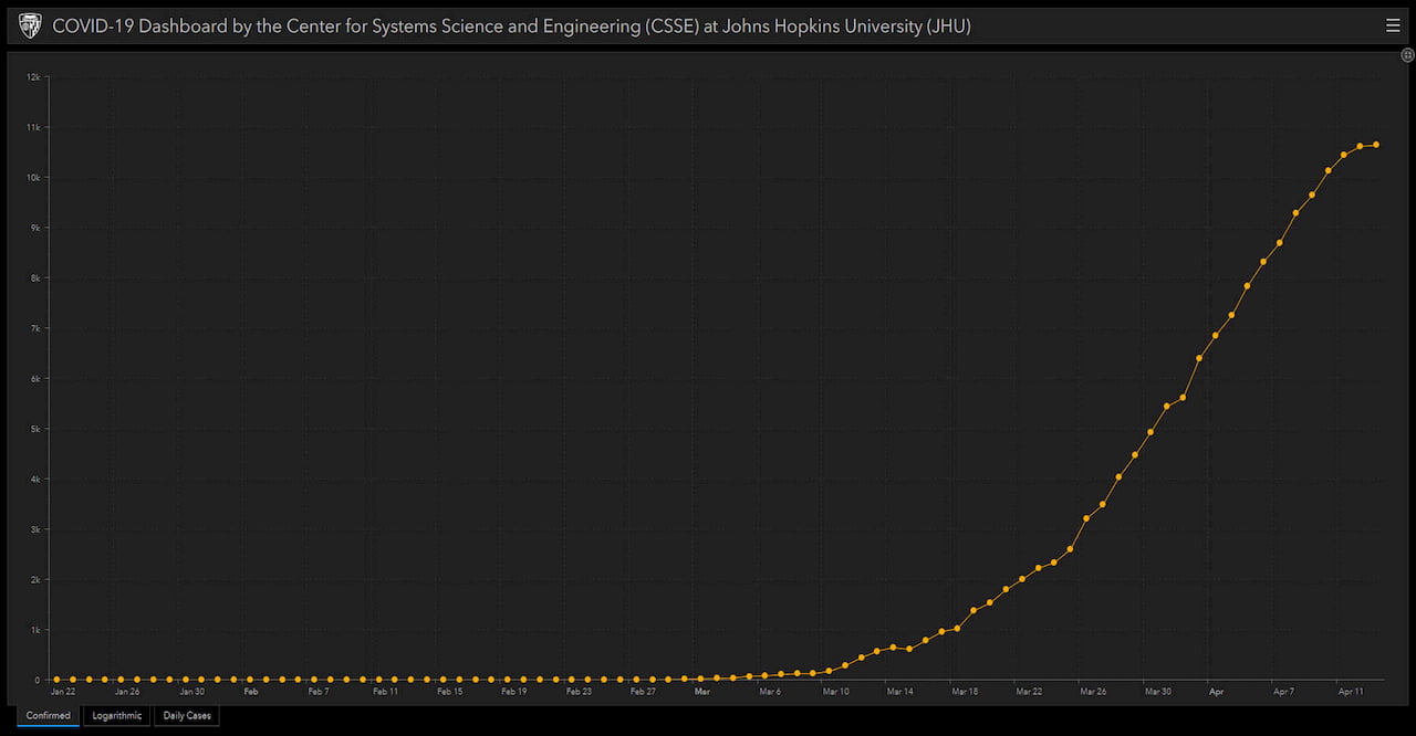
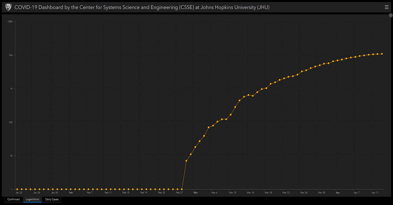
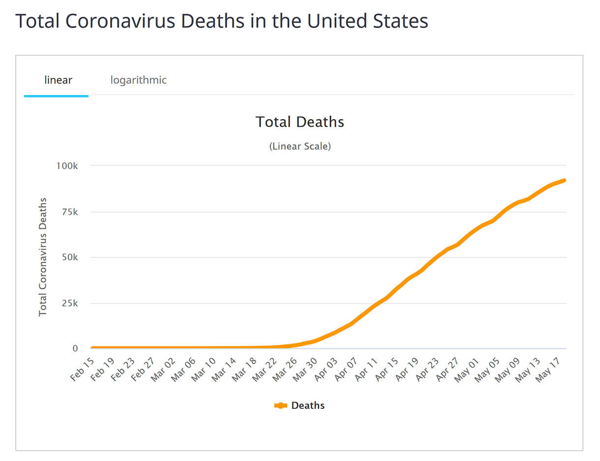
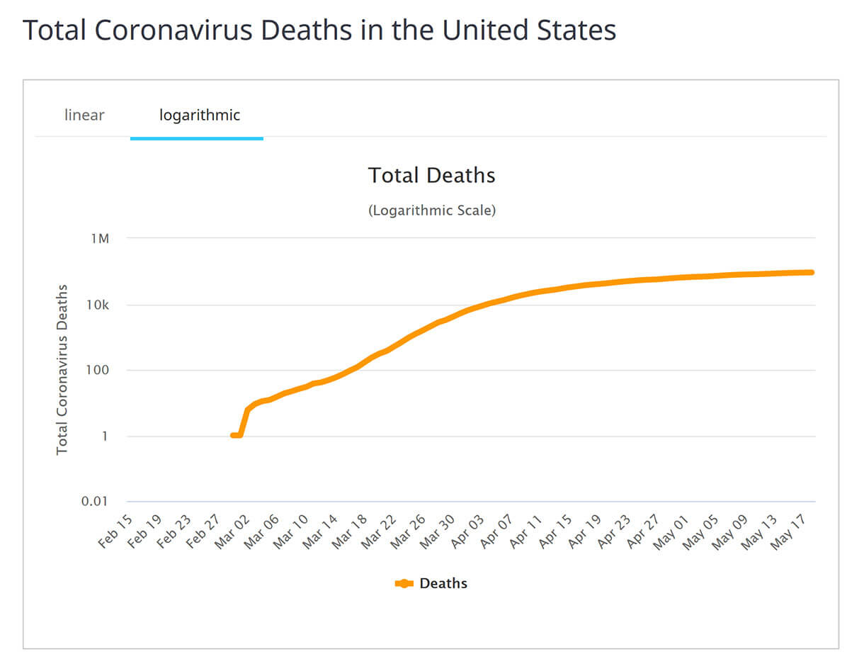
The list on the left shows each state and how many “confirmed cases” and the trends on the bottom right shows a cumulative trend, logarithmic trend and daily increases. The list on the left tells us how states compare to each other overall. The charts (Chart 1-3) help dig a little deeper, but since they only show confirmed cases, the information is limited. One chart that many websites are showing these days is the Logarithmic Chart (Chart 3). On a Log chart, a flattening of the trend is a better way to see that new cases are not growing exponentially.
All in all the Johns Hopkins website does a good job answering how Confirmed Cases count is changing at the National and State level over time.
The next website we’ve been tracking is this one Worldometers. Worldometers is led by an international team with the goal of making various world statistics available. For the USA, we’ve included Charts 4-6 below. These charts use similar charts as the previous website, but also include data about deaths. These charts provide another data point and a better answer to questions about the impact of COVID-19 in the USA.
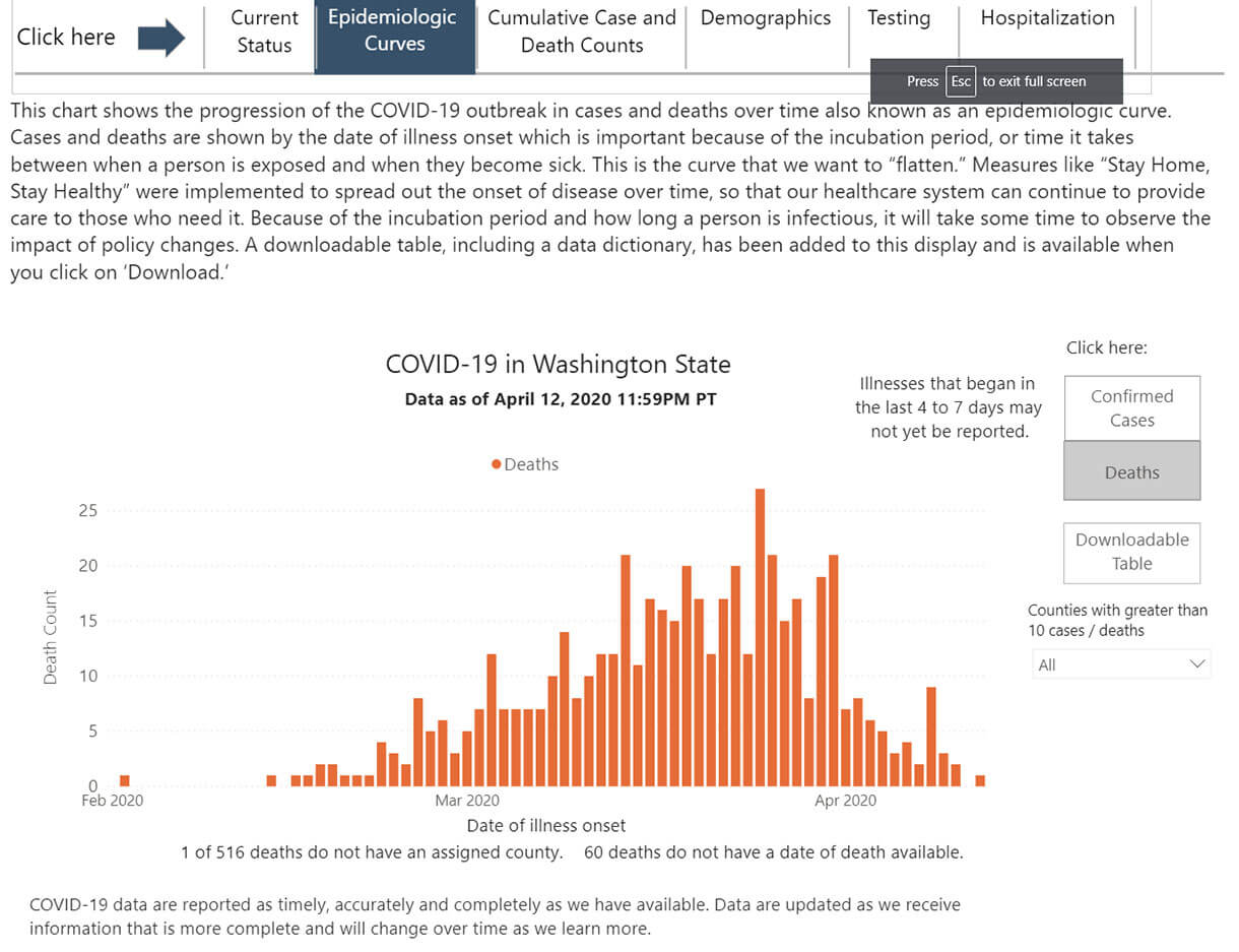
However, given the regional nature of COVID-19, what if we want to focus on the State of Washington? On the worldometers site, we can only see a couple of data points on where Washington State is today and what’s new. The site provide context and really limits us to knowing how a given state is doing relative to the rest of the states, see Picture 2. It doesn’t answer the question whether a state is improving. To help with question locally, we have also been using the state of Washington department of health website.
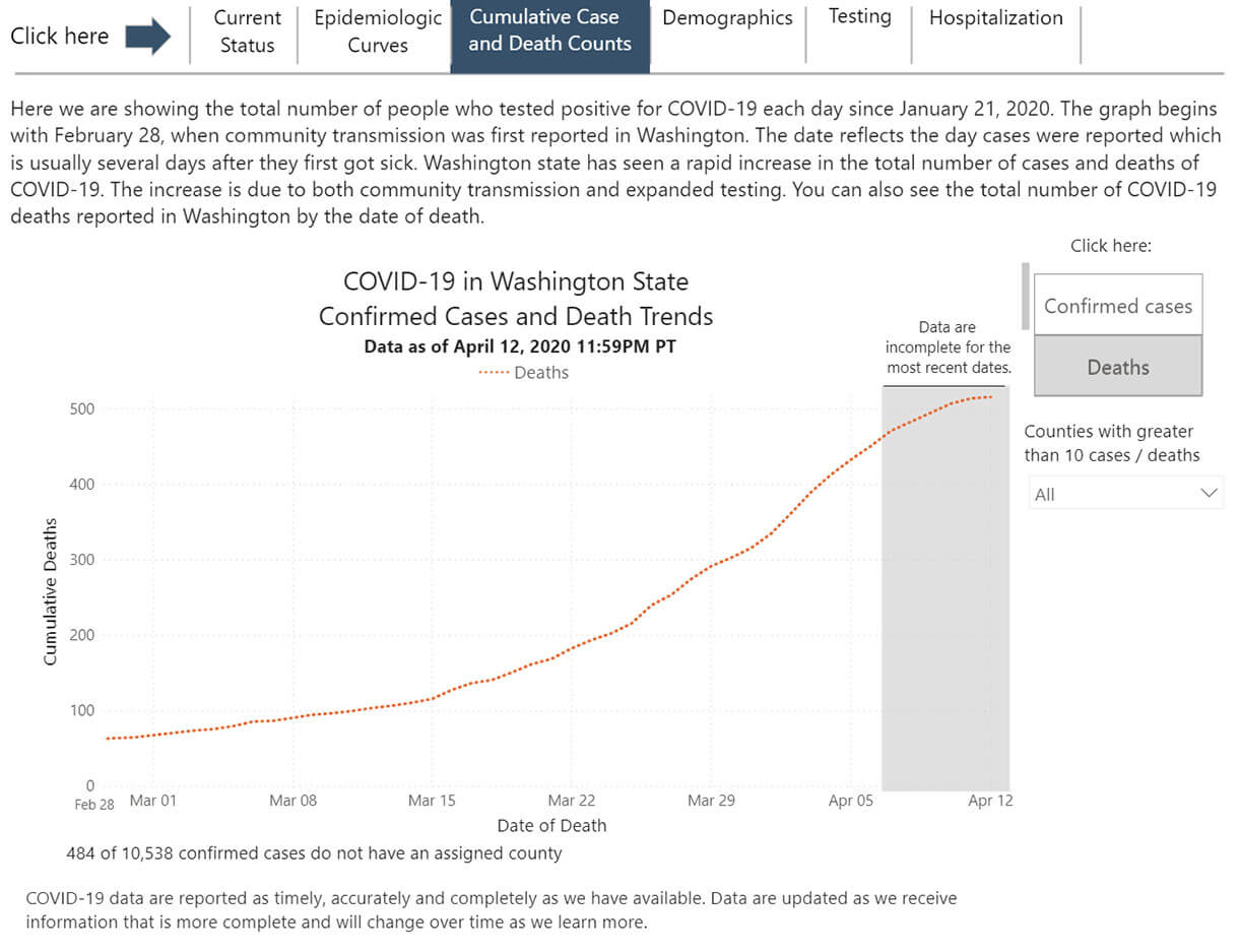
As we’ve seen in previous charts, Charts 7 & 8 from the WA state dept of health (DOH), show the trend for the number of new cases and deaths, as well as the change by day. However, the DOH website uses a different time stamp to plot the data. The Worldometer website uses the time stamp of the day the cases or deaths were reported and the DOH uses the time stamp of when symptoms were first reported.
The WA DOH charts help answer the question “Is Washington getting better?”, and goes a step further to help answer the questions, “What days were the most people infected and when did the infection rate start to slow?” Certainly these questions are even better questions to be asking. However, if you were using the WA DOH website and your neighbor was using Worldometer, you could have a different answer to the question “What day did Washington start to get better?” Of course, this discussion would occur using proper social distancing protocols.
In summary, there is very interesting data out there to shed light on the health impact caused by COVID-19. Just like when using industrial data analysis tools, there are challenges in getting specific questions easily and consistently answered.
The key to data inquiry success is making sure the information you’re looking at easily answers the question you’re asking for everyone in the plant. Often, the answer to one question leads to more questions, so your data analysis tools better keep up.
Stay safe and be well, we’ll all get through this current situation together!