In this article, we’ll explore the essential elements of a Data Management Scorecard and introduce a new metric, the Workflow Productivity Index (WPI). We’ll cover the key factors to include, such as data visualization, reporting capabilities, and cost considerations. By the end, you’ll have a clearer understanding of what to look for in a data management system and how to enhance your scorecard for better decision-making.
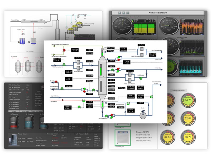
Increase user workflow productivity with dataPARC’s tools and features.
Data Management Scorecard Basics
There are numerous Data Management Systems on the market, and making the right choice for your organization can be daunting. That is where companies turn to their handy scorecard. Often, you’ll end up with very similar results from product to product. Most systems will check off your scorecard basics and appear to offer the same functionality across the board. Before introducing the new metric, let’s review the basics of a Scorecard for evaluating Data Management Systems.
When searching for the best fit for your site, creating a scorecard that considers key factors is important. Typical data management scorecard parameters include data visualization and monitoring for key performance metrics. Additionally, when looking into new software, many sites want to get their users up and running quickly. Include concepts such as intuitiveness and user-friendliness in the system. These factors can help minimize resistance to the change.
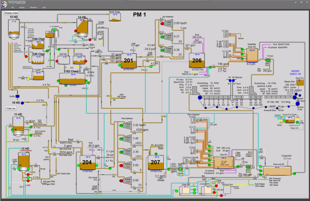
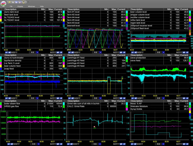
The ability to create customized process graphics can be an important factor to consider when evaluating data management and manufacturing analytics software.
Many sites are looking for more robust reporting and analytics capabilities. Smaller sites with a less experienced workforce may want to know about technical support services. Cost is at the top of many scorecards. It is important to note that one should compare the total cost of ownership over 3-5 years, not just the initial implementation cost of year one.
Lastly, some companies may be interested in what other user’s experience has been and their opinion about the management system. This can include how engrained the system is within an industry.
When evaluating data management systems, it’s common to end up with multiple options scoring equally across key measures. But what happens when you’re faced with a tie? That is where this new metric comes into play, to enhance your evaluation scorecard and help you make the right choice. That’s when you need to dig deeper into how well the systems facilitate the flow of work. The Workflow Productivity Index.
What is the WPI?
The WPI (Workflow Productivity Index) assesses not only whether the software can perform tasks but also how quickly and efficiently users can accomplish those tasks within the data management system.
This index ensures that users aren’t slowed down by the system, allowing them to operate at the speed of thought. There’s a difference between simply being able to complete a task and doing it quickly and effectively. This index helps differentiate between systems that only offer functionality and those that truly enhance productivity.

What goes into the WPI?
Determining workflow productivity can involve a variety of qualitative and quantitative considerations. For instance, time savings can be evaluated by looking at processing speed and task automation. Ease of use, integration, and collaboration within the system are harder to quantify but significant to assess.
Here are several methods to quantify the WPI for a given data management system:
Time to Insight:
This measurement tries to identify the amount of time it takes to troubleshoot. To find the root cause by utilizing the data management system. When evaluating this, consider if trends and graphics open quickly and load the data. Can you see many days, weeks, or months of data at one time? How many clicks does it take to get where you want to go? What other task are you currently doing to identify production issues, how long would that take with the data management system under review?
Task Completion Speed:
Task completion speed is less about troubleshooting and more about getting to see the data how you want to see it as quickly as possible. Whether that is in Excel, in a Histogram, Pareto Chart, Box Plot or other visualization system. What is the number of steps or clicks it takes to go from a tag or trend to a report or other analytics view? Are user interactions set up in a way to increase efficiency?
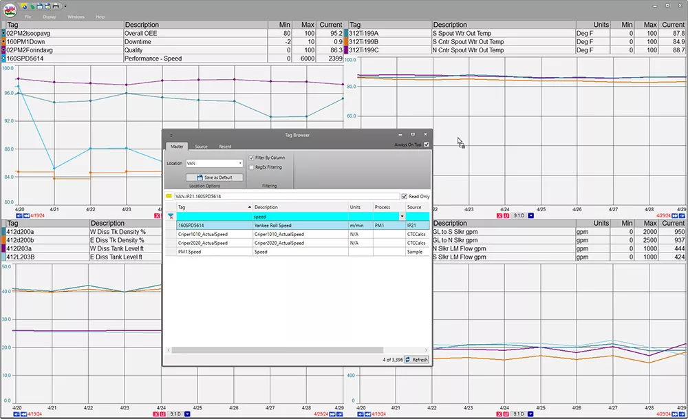
With PARCview, drag tags directly from the tag browser to a trend for quick data analysis—a key factor to consider in data management systems.
Data Accessibility:
Data accessibility is pivotal to any data management system. Having a system with fast and easily accessible data can allow users to keep moving through the process and ensure the system isn’t slowing them down. They have data at “the speed of thought”, so when you compare last year’s summer data to present data, you don’t forget why that metric was relevant. Or, in a process upset, you can juxtapose the last 5 runs of a product to the current run to find the possible root causes quickly.
Problem-Solving Effectiveness:
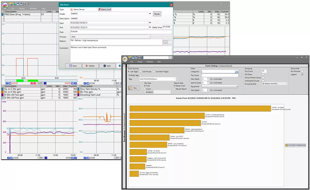
Can you do all your problem-solving and analysis in one place? For example, having a data management system with integrated downtime and reason analysis can keep information at the front of mind. It means users do not have to identify causes in one place and record them in another. This allows for linking, screenshots, and a clearer direction on how a resolution came to be.
While a few extra clicks here and there may seem minor, they can accumulate significantly over time. Quick report generation and trend analysis are essential for timely decision-making and effective process management. Overall, these metrics are important for optimizing system performance, improving user satisfaction, and achieving operational excellence.
Consider the WPI by Position
To help think of WPI, separate tasks into different job functions and positions. Optimizing workflow productivity across various roles can assist in determining how each position interacts with the data management system. Here’s a breakdown of how a wide range of roles utilize the system to enhance efficiency and decision-making.
- Console Operator – Operators are responsible for setting up machines and ensuring they are running properly. Real-time data is critical to keeping everything on track. They need a data management system to easily enter data into and identify process upsets when they occur.
- Process Engineers – Often, Process Engineers are optimizing systems. They need to analyze the cause of alarms, find when the problem happened, if there’s a pattern, etc. They have to look at historical data to help optimize the process in the future.
- Manager / Supervisor – Managers and supervisors have a range of duties requiring them to look at real-time and historical data. They must make data-driven decisions affecting daily operations, project management, and resource allocation. They want to minimize downtime and issues in production. They need the ability to access entry logs and audits to verify data.
- CEO / C Suite – The C Suite can use data management systems at another level. This could be an enterprise system with access to multiple site’s data. For this, it is important to be able to toggle between sites and have the proper access and security in place.
- All Positions – Any data management system should have a workflow that makes communicating with coworkers easier.
Understanding how each role interacts with the data management system helps streamline workflows and enhance productivity. By examining the specific needs and responsibilities of console operators, engineers, managers, and executives, we can ensure that the system supports efficient operations and effective communication throughout the organization.
Check out dataPARC’s real-time process data analytics tools & see how better data can lead to better decisions.
How to Identify WPI During Product Demonstrations
Now that you know the WPI, you might wonder how to incorporate it into your research. Here are some questions to ask a sales/technical representative that might showcase the functionality of a tool beyond just the features.
Intuitive:
During a product demonstration, you want to see how intuitive the system is. Does it present obstacles to use? It is like other systems you already have in place, such as Microsoft. Are there training materials accessible to every user? Does the software support an accelerated learning environment? It cannot be too hard to learn and use. If it has a steep learning curve, it will be less likely to be adopted.
Data Speed:
Witness the data speed. Data speed should be no obstacle to the user’s speed of thought. Is “off-line activity” minimized? Is the user kept in the real-time realm during analysis?
Functionality:
Observe use case segments and the Workflow thought process when navigating and using functions to support everyday tasks. Does the software keep up with the speed of thought? Is there a noticeable compression of steps and clicks to move through conclusions and get to an answer?
Seamlessness:
Witness the number of usable functions at the users’ fingertips. How well do these integrate into the Workflow? Are these functions easy to access, not interrupting the workflow?
Demonstrate Role Usage:
The vendor should demonstrate the software and show its ease of use for the widest variety of staff, including non-savvy computer users. There should be an appeal to multiple roles and levels – from the front-line users to corporate-level staff. What benefit is it for each of these levels?
WPI with dataPARC
dataPARC offers many tools tailored to enhance one’s WPI, making data analysis an easy process.
Time to Insight
Time to insight is all about troubleshooting and data analysis. With PARCview, analysis tools like Histogram, Pareto, and Export to Excel are available in trend from the right-click menu. There is no need to open a new display, find the tag, or adjust the timespan. PARCview pulls in all the important information at once.
Additionally, the Excel Add-in offers import options beyond calculations like Pi Datalink. When utilizing a data normalize sheet, the data comes in as a data dump, with no formulas and recalculations every time you open it. But, change the date and rerun it for fast and fresh data.
Unique PARCview displays like Centerline speed up the troubleshooting process. Centerline is a tabular run-based report. View run comparisons side by side to identify what is different about this run.
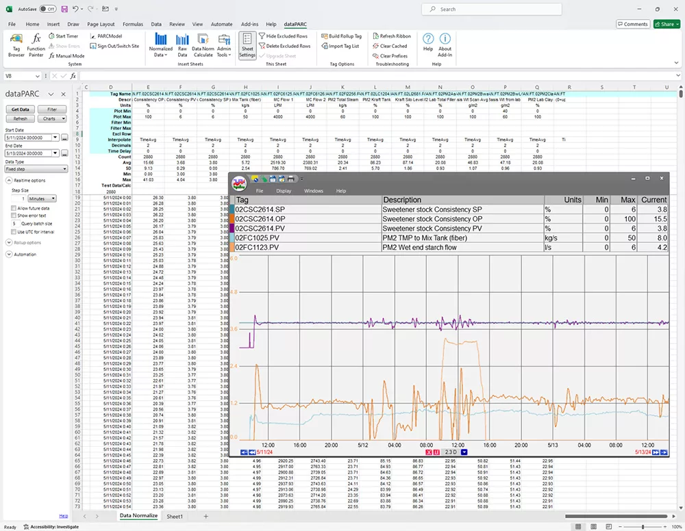
dataPARC’s Workflow Productivity Index in action, demonstrating seamless integration between trend analysis and Excel for enhanced data accessibility and efficiency.
Task Completion Speed
As mentioned above, the trend right-click menu contains all the necessary tools and will apply them directly to the data currently displayed. There’s no need to reset or reconfigure in the middle of a session.
dataPARC aims to present data at the speed of thought. Think about an issue, pull it up simultaneously, navigate back in time, and then drag that timestamp to another trend. Keeping your train of thought alive while crossing out potential root causes simultaneously.
Data Accessibility
dataPARC has a performance data engine (PDE) to ensure data is plotted faster than any other trend. The PDE is a set of server-side applications that are used to increase data retrieval speeds. It maximizes trends and other reporting in PARCview.
Other features that promote data accessibility include double click and click and drag features. Any tag in PARCview can be double-clicked to view a trend. Drag more tags or even a timestamp into a trend to get to your answer quickly.
Problem-Solving Effectiveness
With dataPARC, problem-solving is contained. Alarm an issue, troubleshoot it, and record the reason in PARCview. Use Pareto charts to review the most reoccurring issues to help reduce downtime.
WPI: A Summary
Finding the right data management system as a manufacturer can be challenging. At times, the decision comes down to which software will save users time and effort on a regular basis. Efficient time management from both an operational and employee perspective translates directly into cost savings. Saving effort ensures all employees interacting with the tool can easily communicate and identify problems. Furthermore, a positive user experience means workers will be motivated to learn more about the tool and have energy for other tasks. The right data management system will enable key data-driven decisions, achieving the company’s goals and outcomes.

