In this blog, we’ll introduce a set of downloadable OEE dashboard templates designed for manufacturing environments. We’ll also explore what makes a good OEE dashboard and share tips for building your own in systems, whether you have a fully integrated system and can utilize tools like PARCview’s Graphics Designer or are just starting out and are utilizing Excel or Power BI.
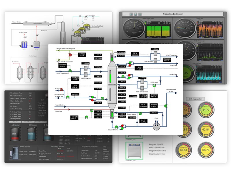
Get OEE Faster with Seamless Data Integration Across Your Enterprise with PARCview
Measuring performance on the plant floor is nothing new, but doing it well can still be a challenge. One of the most widely used metrics for evaluating manufacturing efficiency is OEE, or Overall Equipment Effectiveness. It provides a simple, standardized way to assess how well a piece of equipment or production line is performing by combining availability, performance, and quality into a single percentage.
While the concept is straightforward, implementing OEE often isn’t. Manufacturers struggle to visualize OEE data in a way that’s both clear and actionable. It’s one thing to calculate OEE; it’s another to deliver that information to operators, supervisors, and leadership in a format that drives improvement.
That’s where an OEE tracking software and dashboards come in.
Why Use OEE Dashboards in Manufacturing
Dashboards give teams the visibility they need to stay ahead of performance issues. Instead of waiting for end-of-shift reports or digging through spreadsheets, operators and supervisors can see how equipment is running right now. This immediate insight allows for faster responses to downtime events, bottlenecks, or quality concerns.
An OEE dashboard is especially valuable because it highlights the key areas where losses occur. Whether it’s unplanned downtime, slower-than-expected cycle times, or increased scrap, the dashboard makes it easier to spot trends and take action. With this visibility, teams can prioritize efforts that reduce downtime, improve efficiency, and increase throughput.
Dashboards also play a big role in supporting continuous improvement programs. For companies following Lean or Six Sigma principles, OEE provides a measurable way to track progress over time. When combined with visual tools like dashboards, these metrics become easier to share, easier to understand, and easier to act on. An OEE dashboard can help kick off and pinpoint how the machine is running in Daily, Weekly, and Monthly Operational Review meetings, also commonly referred to as DORs, WORs, and MORs.
Key Elements of an Effective OEE Dashboard Template
OEE is made up of three metrics: Availability, Performance, and Quality. Multiplying those metrics together gets the Overall Equipment Efficiency. Here is how each of those metrics are calculated.
- Availability measures how often equipment is running when it’s supposed to.
Availability = (Operating Time / Planned Production Time) × 100 - Performance looks at how efficiently equipment is running while it’s operating.
Performance = (Ideal Cycle Time × Total Count) / Operating Time × 100 - Quality reflects the percentage of good units produced.
Quality = (Good Count / Total Count) × 100
Each metric should be visible on the dashboard as an individual value, along with the overall OEE percentage. Showing them separately helps teams pinpoint which factor is affecting efficiency the most.
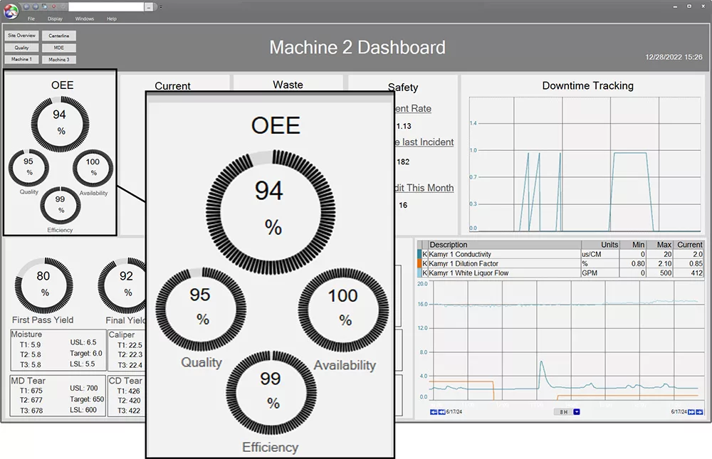
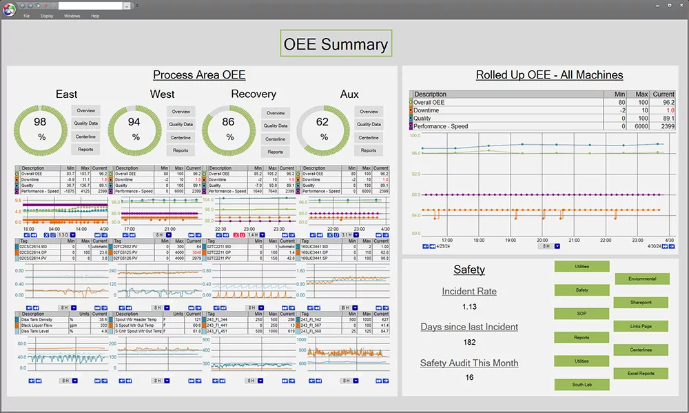
All elements of OEE are displayed clearly in the upper right corner for users to access the information quickly. Downtime, and quality information are also captured throughout this dashboard.
Historical Data
Another key element of a good OEE dashboard is to include trends of historical values in addition to these metrics. This allows users to monitor progress over time and identify recurring issues. A single snapshot is useful, but trends tell the full story.
Time Periods
Depending on the industry, it could be beneficial to include daily or shift-level breakdowns. OEE can fluctuate throughout the day based on factors like operator changes, product types, or maintenance activities. Breaking the data down by time period provides better context and helps uncover root causes faster.
Colors and Charts
Adding color to and gauges helps users read the data more quickly. These visual cues make dashboards easier to scan and interpret. Use consistent color coding for status indicators, display alarm thresholds clearly, and highlight when values fall outside of target ranges. This ensures that problems stand out without requiring a deep dive into the data.
Data Integration
Lastly, the most useful dashboards are fully integrated with plant data systems. That means pulling in real-time process data, manual entries from operators, and lab results when needed. This creates a single source of truth that supports fast, informed decision-making. If you are using Excel to enter and calculate OEE, this will get you by in the short term, but start looking at alternatives and how to get all your data in a centralized location so multiple users can view and access the dashboards at once. Removing errors and manual processes.
Building a Customized OEE Dashboard
Regardless of which tool you use to make a customed OEE graphic tailored to your plant’s needs, there are a few steps you can take to make sure it is what you need. The downloadable dashboards have two dataPARC Graphic OEE Examples in .XAML format. Created using the PARCview Graphics Designer. With drag-and-drop elements, flexible design tools, and real-time tag integration, it’s a fast way to visualize performance metrics like OEE.
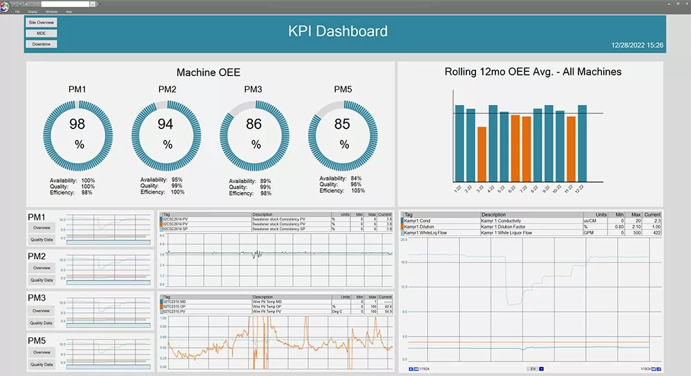
Customized dashboard featuring OEE dials, trend charts, and a 12-month rolling average to track performance across multiple machines. This dashboard provides a lot of key information all on one screen.
Step-by-Step: Building an OEE Dashboard
- Define the Scope and Plan the Layout
Start by deciding how many machines or production lines you want to include on the dashboard. Will it focus on a single asset, a group of machines, or an entire area of the plant? Your answer will shape how much data needs to be displayed and how the layout should be structured. Sketch a rough outline of your display to organize key elements like OEE scores, shift breakdowns, and trend charts. - Identify the Required Data
Once you’ve defined your scope, gather the data you need for Availability, Performance, and Quality calculations. You’ll typically need runtime/downtime indicators, production counts, reject counts, and cycle times. Make sure the data is reliable and updated frequently enough to be useful. - Choose How to Visualize Key Metrics
Decide how you want to present the overall OEE score and its components. You might use gauges for quick reference, bar charts for comparing shifts or machines, and trend lines to show performance over time. Keep the visuals clean and focused on what users need to see at a glance. - Set Targets and Highlight Exceptions
Define performance targets for each OEE component and use visual cues to make problems easy to spot. Color coding, threshold lines, and alerts can help highlight areas that need attention without overwhelming the display. - Build for Reuse and Consistency
If you’re creating dashboards for multiple machines or areas, consider building a standard layout that can be reused with different data sources. A consistent look and feel helps teams navigate dashboards more easily and compare performance across equipment.
Downloadable OEE Dashboard Templates
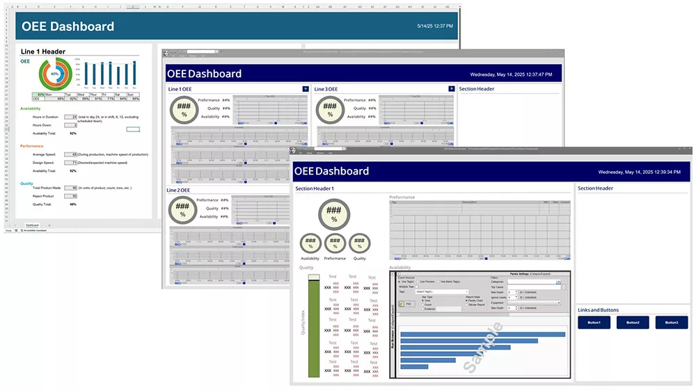
To help you hit the ground running, we’ve put together a set of downloadable OEE dashboard templates designed for manufacturing environments. These templates are built using PARCview Graphics Designer and offer a variety of layout options to suit different use cases on the plant floor.
Check out the downloadable OEE Dashboard Templates, including an Excel sheet.
What’s Included:
- A selection of dashboard layouts for different levels of visibility, including shift-level views, 24-hour trends, and line-level summaries
- Pre-configured gauges, tables, and charts tied to OEE calculations
- Color-coded performance indicators with adjustable limits and targets
- Notes on which tags to configure and where to connect them
These templates are a great starting point for teams looking to standardize how they track and visualize OEE.
For users who aren’t yet working in PARCview, we’ve also included an optional Excel version of a basic OEE dashboard. It’s a simple, editable template that can help you organize and present your OEE data before moving to a real-time environment.
Getting Started in PARCview: Importing and configuring the templates is easy. Once downloaded, open the file in Graphics Designer, connect your tags to the appropriate elements, and adjust the layout if needed. You can use the templates as-is or customize them to match your process and performance goals.
Best Practices for Implementing OEE Dashboards
Building a dashboard is just the first step. To drive real value from your OEE displays, you need to make them part of your team’s daily workflow.
Collaborate with Operations and Quality Teams
Start by involving the people who use the data. Operators, supervisors, and quality personnel all bring different perspectives that can shape a more effective dashboard. Ask what metrics they need at a glance, what information helps them make decisions, and how they prefer to view performance trends.
When everyone contributes, the dashboard becomes a tool they trust and rely on. More information beyond OEE can be added to these dashboards to begin the drill down and troubleshooting process when an upset happens.
Use Dashboards in Shift Handoffs and Daily Meetings
Make the dashboard part of your regular communication rhythm. Display OEE dashboards during shift change meetings to review how the previous crew performed and what to focus on next.
Daily production meetings, use the visual data to identify bottlenecks, call out wins, and align teams on shared goals. When dashboards are visible and discussed, they become part of the culture.
Continuously Improve Based on Feedback
Dashboards should evolve with your process. Gather feedback regularly and look for opportunities to refine your layout, add relevant tags, or remove clutter. As your team gets more comfortable with the data, their needs may change. Stay flexible and treat your dashboard like a living tool, something that grows with your operations.

Putting it Together
A well-designed OEE dashboard can make all the difference in how teams understand and improve performance. By starting with a pre-built template, you save time, ensure consistency, and give your team a solid foundation to build on.
The OEE dashboard templates provided in this blog are designed to help manufacturing teams get up and running quickly. Whether you’re building your first dashboard or refreshing an existing one, these tools can jumpstart the process and eliminate guesswork.
Download the templates, connect your plant data, and make them your own. And if you’re using PARCview, explore how Graphics Designer can help you customize and scale your dashboards across the site.
Download OEE Dashboard Templates and take the first step toward more effective, data-driven operations.
Track Performance With These Downloadable OEE Dashboard Templates
Frequently Asked Questions
- What should be included in an OEE dashboard?
- The components of OEE should include availability, performance, and quality, along with the data with which those values were calculated. This allows the user to drill down and investigate why the machine is not performing at its best. Other factors, including downtime or quality reasons, can help speed up the troubleshooting process.
- How do I calculate OEE?
- OEE is the machine’s availability x performance x quality. For a detailed breakdown of the OEE calculation check out this resource: How to Calculate OEE.
- How many machines should I include on one dashboard?
- This is entirely dependent on your goals and the size of your manufacturing facility. If you have a large plant and a weekly operational review where your team would like to see all OEE values, having 10+ machines on one dashboard makes sense. That said, maybe this all-machine overview is a bit more simplistic and doesn’t have the deep-diving information, but it has links to the dashboards with only one or two machines on them. This is where you might review during a morning meeting and where your more detailed information should live.
- Can I customize the dashboard templates for my process?
- Yes! These templates are yours to take and customize as you wish, they are just a starting point to give you an idea of what information could be helpful to see your data.
- What are common mistakes to avoid when building an OEE Dashboard?
- The most common pitfall is not taking into consideration who it going to use the dashboard and thus putting too much or too little information on it. This can be avoided by speaking with the user and asking for input of feedback. Another common mistake is not making the data traceable. Users may be able to see OEE is low, but not know why, or see Quality is the reason but not be able to dig deeper. Really think about the usability and what steps are going to be taken when they see this number.
OEE: The Complete Guide
All the resources you need to successfully implement, analyze, & improve overall equipment effectiveness.