Most modern manufacturing processes are controlled and monitored by computer based control and data acquisition systems. This means that one of the primary ways that an operator interacts with a process is through computer display screens.
These screens may simply passively display information, or they may be interactive, allowing an operator to select an object and make a change which will be then be relayed to the actual process. This interface where a person interacts with a display, and consequently the process, is called a Human-Machine Interface, or HMI.
As you can imagine, or may have experienced, the design of theses interfaces can be confusing and difficult, or clear and straightforward. In a situation where the interface is controlling a massive process such as a power generation plant, oil refinery or pulp mill, it is crucial that the HMI be as understandable and straightforward as possible. Mistakes and misunderstandings caused by poorly designed HMIs have been at least partially implicated in some very serious industrial accidents.
Monitor, report, & analyze production loss from unplanned downtime, poor quality, and performance issues.
HMI Design Best Practices
All of the suppliers of computer based control systems provide software to configure displays to interact with their controllers. As with any type of software, each configuration package has its strengths and weaknesses. There are also vendors that do not supply control equipment, but specialize in collecting and storing data from both the process and the business activities around the process. These process data visualization tools provide configuration packages for displaying data in unique ways to everyone involved in plant operation.
HMI Classification
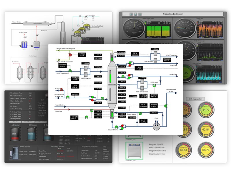
For production related processes, HMI screens can be classified into four basic groups:
- Tabular and text based screens – lists or tabular groups of data and status values
- Schematic screens – data are displayed on schematic diagrams of the actual process
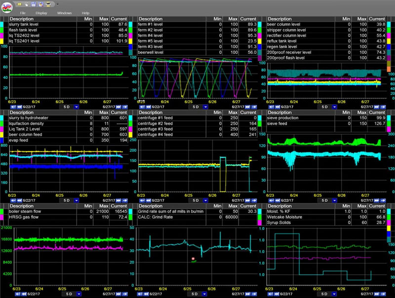
- Trend screens – current and historical values of data plotted on graphs versus time
- High Performance screens – current data enhanced by basic graphic elements to convey additional information
We’ve discussed advantages and disadvantages of these different types before. The purpose of the remainder of this discussion is to talk about the proper and improper ways to design what is probably the most prevalent type of screen, the schematic diagram screen.
The Schematic Screen
There is an innate appeal to a schematic screen. If a level is seen to be increasing in a tank, as indicated by a moving bar indicator within an image of the tank, it is intuitive to click on a control valve at the outlet of the tank and increase the flow out of the tank to bring the level down.
The visual connection is more meaningful than reading labels on a group of controller representations:
The goal of any HMI screen is to develop “situation awareness”, or the ability to identify the process and comprehend the critical elements of a situation. In the case of trying to increase awareness, and also control a process through a schematic-style screen, the design of that screen is going to be a major factor. Following are some guidelines for maximizing the effectiveness of a schematic diagram HMI screen:
On the road to digital transformation? Get our Free Digital Transformation Roadmap, a step-by-step guide to achieving data-driven excellence in manufacturing.
Color
A discussion of color has to start with the selection of a “good” background color. When DCS systems were first adopted, the background color for all screens was no color at all, or black. Black has the advantage of providing good contrast with almost all of the other colors, but the curved CRT screens of the time tended to reflect light. To minimize this, many control rooms were darkened, to accommodate the screens.
The problem with a darkened room is that is makes other normal tasks, such as paper-based reading and writing, difficult. It also negatively affects alertness, especially in operators with disrupted sleeping patterns as a result of working rotating shifts.
The current thinking is to have a brighter control room. In order to avoid eye strain, which can occur as operators shift their gaze from the room at large to a display, the display should have approximately the same luminescence as the surroundings. A gray background fulfills that need and still provides a background against which other colors can be seen.
When color is used it should be applied consistently and should convey meaning. Bright primary colors should, for the most part be avoided, except to help call out abnormal situations. Static vessels and equipment should be shown in shades of gray. The goal is to create displays which under normal operation are somewhat boring. It is easy to see a flashing red alarm condition on a muted-color screen; it would be much more difficult if the entire screen was a dense collection of high contrast, bright colors. Specifically, red should not be used to indicate a “normal” (on/off, open/closed) state of a piece of equipment.
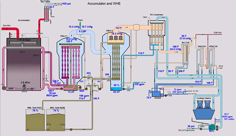
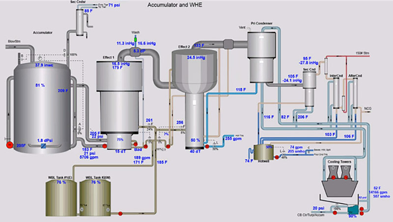
Often process flows are more obvious if the piping lines are shown in a color based on the materials they contain. For example, a shell and tube liquor heater would have four lines attached to it. The two liquor lines would have the same color, the steam supply line and the condensate line out might each have their own different color.
Sometimes color can be used to depict a process condition, such as in a multiple effect evaporator set. In this case, it is important to know, especially for troubleshooting purposes, that internal areas of adjacent vessels are at the same pressure. Muted color coding can be used to indicate the parts of the vessels which are at equal pressures.
Some display systems will allow a diagram such as this to be shown in two modes. In normal operating mode, the vessels can be shown as simple, non-distracting shapes. For reference purposes, training, and troubleshooting, the internals and the pressure color coding can be exposed.
When designing an HMI screen, remember to never rely solely on color to display an abnormal situation. Some people are color blind and do not detect certain color differences. Simply changing the color of a value, or the background of a value, to red, in order to show an alarm is not sufficient. In addition to the color change, a flashing border or a symbol which represents an alarm state, should also be displayed.
Layout
Early schematic diagrams were often based on process and instrumentation diagrams (P&IDs). These diagrams were drawn to be used as reference material by engineering and instrumentation personnel; they were not designed to promote the situation awareness of an operator. A set of screens based on P&IDs to represent a process could be called “flat”. Each screen would display a section of the process in great detail, and the next screen in the progression would show the next part of the process. Control hardware limitations encouraged putting as much data on each screen as possible.
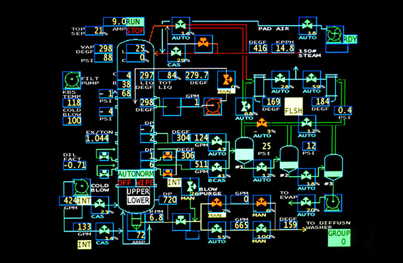
Early schematic screens often contained overwhelming amount of data
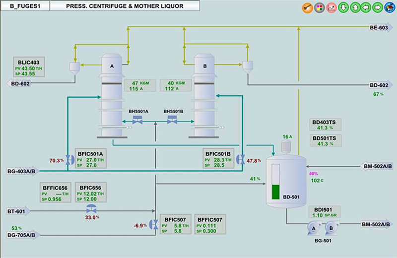
A more effective way to represent the process is through the use of levels. A single top level diagram can show the major pieces of equipment in a unit and the most important process variables. Support equipment such a heat exchangers and pumps might not even be shown. The next level “down” would contain a set of more detailed views, perhaps more analogous to a P&ID, for sub-sections of the process shown in the overview. Depending on the complexity of the process, a third level of screens might be used to support the process equipment shown in the second level screens. The goal of this approach is to avoid overloading any given screen. By placing detailed information on reference screens which are one level down in the information tree, each display can be kept uncluttered and quickly comprehensible.
Schematic diagrams should not be overly dense in their presentation of information, and they should attempt to represent the actual physical layout of the equipment as much as possible. It is common for operators to work in the field before becoming control room operators. If the reflux drum for a distillation column is on a platform near the top of the column, it should be shown as close to that location as possible in the schematic diagram. It should not be located elsewhere on the screen just because the positioning of the column icon didn’t leave enough room to put the drum in the correct position. The whole diagram should be redrawn to reflect the correct spatial relationship.
Depicting equipment literally can be taken too far. As the graphic capabilities of display systems advanced, it became possible to create realistic, textured, 3D renderings of equipment. The 3D models lead to pretty, but not functional, displays. “Enhanced” equipment depictions add no value, but do add visual distraction which can interfere with comprehension of the data on the screen.
Along a similar line, some display packages offer the capability to add animation to a screen. While this may initially appear to be attractive, animation works against creating a solid HMI. Our eyes are naturally drawn toward movement. An animation such as a spinning pump impellor or an animated flame could potentially distract an operator and delay observation of a critical data-based problem.
In summary, uncomplicated process schematics are easier to comprehend and reduce the chance that someone will make a control error.
Check out our real-time process analytics tools & see how you can reduce downtime & product loss.
Process Values And Labeling
The relative importance of dynamic values and labels needs to be considered when designing a schematic screen. Live process values should be more prominent (larger or bolded font) than the unit descriptors which come after them. Process values which are not critical, for example the amperage of a normal pump, should not be on an upper level, overview-type screen. This type of reference information should be placed on a lower level, detail-type screen.
Live values should be displayed with an appropriate number of decimal points. If a flow is over 10 gallons per minute, there is probably no need to include tenths of gallons per minute in the readout, just because the meter on that flow can accurately measure with that precision. A minor, constantly changing “tenths” digit will not generally add to the situation awareness and it will add visual clutter to the overall presentation.
Live digital values can be accompanied by a graphical element such as a bar or circular analog gauge face. Depending on the density of the screen, these analog elements can be used to show the relationship of the current value to the normal range and/or operational limits.
Equipment labels are useful, especially for less experienced people, but should be small. They should not dominate or confuse a screen.
Live process values should be located properly and un-ambiguously on the diagram. One of the major benefits of a schematic type screen is to help an operator visualize the process and to properly interpret the information presented. If four tanks are shown in a row and four levels are shown on a screen, the levels should be shown on the tanks or above the tanks. The levels should not be collected together and put in a “Levels” table to the side of the screen. They should also not be shown between two tanks, creating ambiguity as to whether the level is for the tank to the left or the right.
Consistency And Navigation

As mentioned before, an HMI is more than just a single screen; it is usually a collection of screens. In addition to being able to quickly interpret the information on a single screen, it is important for an operator to be able to move easily among those screens. Toward that end, the screens should have a consistent design approach. With a large control system, it is not unusual to have multiple individuals working on display screens. Each person will have their own approach to displaying information. As a team however, they should try to maintain a consistent look and functionality across all screens.
How an operator navigates among screens is important. Some control and display systems may impose restrictions as to how the screens can be accessed. In general, however, a designer should keep the number, function, and location of the navigation buttons the same on every screen. Consistency of navigation removes one cognitive task from the mind of an operator in a crisis. Group the screens in a logical hierarchical order. Include direct access buttons for important screens such as Overview and Alarm Summary pages. While not every page can be one click or tap away from every other page, the design goal is to minimize the number of steps required to move among the screens.
Summary: HMI Design Best Practices
Putting together a schematic process flow display screen is relatively easy. Effective HMI design requires more thought and some adherence to established guidelines. Most of these guidelines presented have been developed through hard experience and/or tested in human factor studies. HMIs created following these guidelines will lead to fewer errors, higher productivity, and most importantly, safer operation of the process.
Want to Learn More?
Download our Digital Transformation Roadmap and learn what steps you can take to achieve data-driven success in manufacturing.